Seems like every week I get an email from some home magazine telling me what the new must-have colors are for my home.
They tell me which colors are on the way out … which ones are the new must have for our kitchens, bathrooms, bedrooms and living areas. As if on a whim I would constantly re-paint my home.
It’s so manipulative. Most of us know what colors we enjoy in our home, what colors make us feel good, and what colors we don’t want. We don’t need Martha Stewart telling us.
Of course it’s all to sell paint, and fabrics, and other things we really don’t need to replace in our homes.
During my 43 years in marketing color was a constant part of the work I did. Designs for page layouts in catalogs, magazines, ads, and all kinds of marketing materials were carefully considered, balanced, and colors chosen and mixed, in backgrounds, headlines, and accents to have the right appeal to that targeted consumer.
It was, and still is, fascinating to me to see how switching one color for another can change the entire feeling conveyed in a design. When designing magazine covers, the simple change in colors used could make a huge difference in the number of copies sold at the newsstand.
There are five color palettes. Warm, Cool, Deep, Pastel, and Neutral.
Within each palette are basic colors for those spectrums. For example, warm colors include red, orange, yellow, hot pink, and gold.
And each of those colors communicates a very different emotion and feeling.
Red, for example, communicates powerful, dynamic, dangerous, hot, stimulating, and aggressive; where as hot pink communicates sassy, sexy, exciting, and sensual; while yellow is cheerful, optimistic, hopeful, and idealistic.
They’re all very different feelings even though they all come from a warm palette.
Every day we choose color, starting with the clothes we decide to wear.
Black is the color that conveys mysteriousness, elegance, intrigue and dominance, so it’s no wonder that every woman has at least one “little black dress” hanging in her closet for special occasions.
Blue jeans, that staple of clothing we wear everyday, are the blue hue of the cool palette and convey emotions of trust, traditional, and knowledgeable. Basic as the jeans themselves.
Brides choose white from the neutral palette because it conveys purity, innocence, cleanliness, and simplicity, but often choose to accent it with pink from the pastel palette which conveys feminine, gentle, romantic, and compassionate.
Behaviorists have long acknowledged that the colors of the walls, textiles, and furnishings in our homes can play an important role in creating moods of peacefulness, serenity, and tranquility so important for emotional health.
Which is why I have never understood stark contemporary homes done without color. Lately it seems hotel chains are updating and refurbishing with really bland modern decors. Not a warm or inviting color anywhere.
I think gray is a good neutral clothing color that goes with just about anything, but gray walls in a home just depress me. When we all complain about gray days, why would we make the interiors of our homes gray, surrounding ourselves with it every day?
My husband is a “beige” guy. Which means there’s a lot of beige at our home in southwestern PA. But it’s a warm neutral and I’ve added complementary colors to our rooms that work with the beige. We’re in the country, and the home has a strong mission/lodge vibe in the décor with large stone fireplaces and beautiful natural woods throughout, so forest greens, and rich deep browns, and accents of burgundy add wonderful color that blends perfectly with the mellow tones of beige.
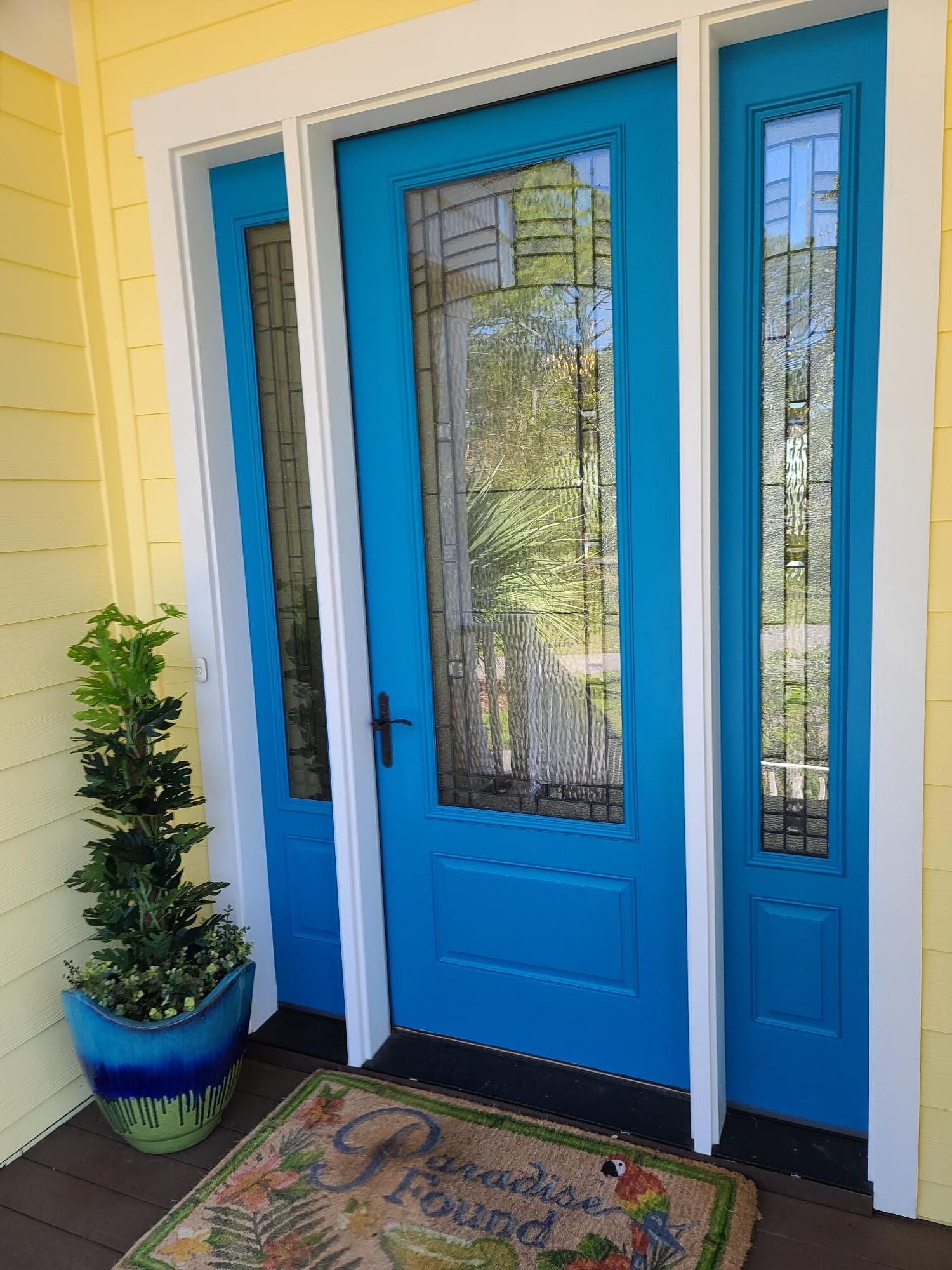
Our home at the beach is totally different. Color everywhere. From sunny yellow to pastel turquoise to soft beach pastels and vivid tropical prints for the porch furniture. A bright blue front door! Even the art on the walls adds explosions of color throughout.
But even with color, there can be too much of a good thing. A little chintz does go a long way. A room all in chintz can be overwhelming. Cabbage flower prints, frou frou, and lots of patterns blended together can create a sense of chaos and clutter instead of serenity.
Living a colorful life is all about our personal preferences. Some of us like earthy colors, others like to be dramatic. Some prefer the soothing coolness of blues and soft greens. And some prefer the richness and elegance of colors from the deep spectrum. But what’s really important is to use color to keep your life healthy. To minimize anxiety. Use color to enhance the purpose of each room.
Cheerful for getting things done, tranquil for restful sleep, invigorating for rooms that stimulate creativity, bold if its a place used for exciting activities and entertainment, or colors that simply express your personality.
“Life is about using the whole box of crayons.”
Ru Paul
If you enjoyed this blog and know someone else who would enjoy it, please share it.